Your brand colours could be your biggest accessibility problem
83.9% of websites have low contrast text. It’s been the top accessibility issue for 8 years straight (WebAIM 2026 report on the accessibility of the top 1,000,000 home pages). This issue usually starts with your brand colours.
While logos don’t have to follow Web Content Accessibility Guidelines (WCAG) colour contrast rules like text on a website, social media posts, or digital document should, your logo colours still matter a lot.
Your logo colours usually dictate the main colours used in your visual branding. They show up everywhere - websites, social posts, PDFs, proposals, presentations, ads. If there isn’t enough contrast between colours, some people will genuinely struggle to read your content.
If your brand colours haven’t been chosen with colour contrast guidelines in mind, this can affect the readability of your website, social media graphics and documents.
From a marketing point of view, accessible brand colours:
Are easier to read (especially on phones)
Work better for people with low vision or colour blindness
Work better for a person with colour blindness trying to distinguish between two similar colours
Feel clearer, more professional, and more inclusive
Help your message land without extra effort from the reader
Many business owners worry that accessible design means only using black text on white backgrounds, no bright or pastel colours, or having to use colours that are a bit blah.
This isn’t about dull or boring design. Your brand colours can still reflect your business’s personality, appeal to your target audience, and help you stand out from the crowd. It’s about choosing colours that look great and work well wherever your brand appears.
Accessible branding can still be bold, vibrant, and distinctive. It usually comes down to choosing the right shades and knowing which colour combinations work well together.
Some common colour combinations that cause issues are:
Light grey text on white
Pastel colours on white backgrounds
Yellow on white
Mid-blue on green
Red and green combinations
Orange and white
Your brand colours are more than a design choice; they are a communication tool. The most effective brands don't just look good; they make it easy for people to engage with their content. By considering accessibility during the branding process, you create a visual identity that works harder for your business and reaches more people.
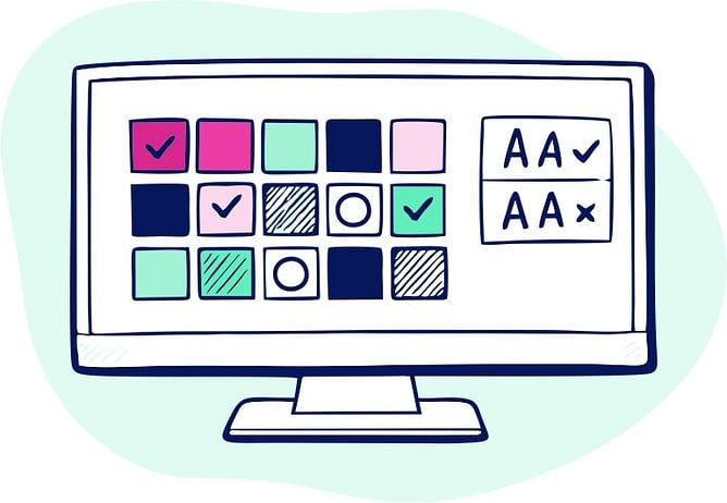
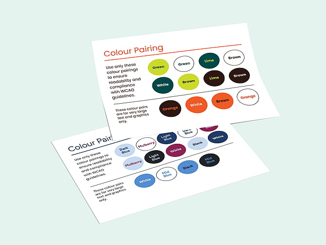
When I create brand guidelines, I don't just choose random colours that fit your brand personality. I use several different colour contrast checking tools to ensure there are colour combo options that work for accessibility and therefore make a better experience for everyone viewing the visual marketing and communications from the business.
I include the accessible colour combinations, so everyone working with the brand colours knows exactly which colours work well together across websites, documents, and marketing materials helping businesses stay consistent while making their content easier for everyone to use.
Want your brand to be seen by more people? I am a graphic and website designer passionate about the accessibility of your visual marketing and business communications. Let's chat about how I can help you.