Your logo is the core of your brand identity
It is at the centre of every piece of visual marketing or communication your business creates.
As the face of your business, your logo serves many purposes and will get used in a variety of ways on different products, from your website to your vehicle signwriting, so it is important that it is SMART.
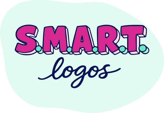
S - Simple
M - Memorable
A - Accessible
R - Resizable
T - Timeless
SIMPLE
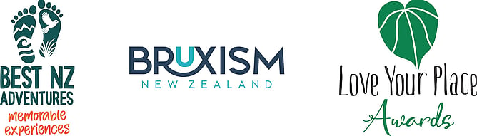
Logos that have stood the test of time, and that have been successful, have been very simple – for example, Nike, Apple, IBM and McDonald's.
Logos that rely on fine details, thin lines, or tiny text often fall apart or become indistinguishable at small sizes. When those details become illegible, your logo looks unprofessional even if the design itself is beautiful.
Simplicity isn't a lack of creativity; it's a sign of confident design. Quite often, it’s more about what you remove from a logo design rather than what you add that makes it a really polished and professional result.
MEMORABLE
Your logo is used on most business touch-points, therefore, you want it to be easy to recognise and recall. It should have a clear visual idea at its core that is distinctive enough to set it apart from every other business in your industry.
The easiest way to achieve memorability is to keep it simple. When simplicity and distinctiveness work together, the result is a logo that not only catches attention but is also easy to remember and recognise again later.
ACCESSIBLE
Your logo should be clear and usable for as many people as possible, regardless of vision or viewing conditions. Colours should have good contrast with each other and the background.
The fonts should be clean and easy to read, even at a small size. Avoid overly decorative or thin fonts that can blur or become hard to read.
An accessible logo should always work in monochrome. If it falls apart in black and white, it’s too dependent on colour to carry meaning. A strong logo retains its identity through shape, weight, and structure alone, making it flexible for printing, embossing, and other situations where colour isn’t available or reliable.
RESIZABLE
Your logo will be used in a variety of different locations, from the side of a pen to the side of a building. It needs to work when very small and very big. It needs to work in both digital and print, colour and black and white, on light or dark backgrounds.
It is not unusual to have an extra simplified logo for use in small spaces, such as your Social Media Profile image. This is often called a Submark.
TIMELESS
Try to avoid following trends and instead create an iconic logo to stand the test of time. You want your logo design to last 5, 10, 20 years. Prioritising strong, simple ideas over decorative effects that may quickly date gives you a stronger chance of becoming iconic rather than outdated.
Timeless logos focus on strong fundamentals: clean shapes, considered typography, and a clear concept. They may be quietly updated over time, but their core identity stays consistent.
The logos I design follow the SMART philosophy to give your business a strong, strategic foundation. A foundation that’s Simple, Memorable, Accessible, Recognisable, and Timeless. Because a great logo isn’t just something that looks good on day one; it’s something that continues to work hard for your brand across every touchpoint, every platform, and every stage of growth.
If you want to know more take a look at my logo design page.
If you’re ready for a logo that does more than just look the part, a logo that supports how people see, remember, and connect with your business, get in touch so we can create something SMART together.